Theory
I drew the butterfly curve as it sharpens
In the morning it barely matters where you center it — every strike prices about the same. By the close, the value collects on one point. Here is how that curve actually changes, and how I picked the center.
I have already written about why I buy the butterfly early — I open the butterfly before price arrives.
That post gave the result: the same fly cost 3.5× more five hours later. This one draws what happens in between. Once you can see how the curve changes, the reason stops needing an explanation.
At the end I have added how I picked the center, because without that this structure is nothing.
1. Start with the shape at expiry
On August 20 I used these three legs.
7,670 put  buy 1    ← upper wing
7,650 put  sell 2   ← center
7,630 put  buy 1    ← lower wing

wings 20pt wide · first contract paid 2.25
The expiry math is four lines. One contract is $100 per index point.
max profit = (wing − debit) × 100 = (20 − 2.25) × 100 = $1,775
max loss   = debit × 100                               =   $225
lower breakeven = 7,630 + 2.25 = 7,632.25
upper breakeven = 7,670 − 2.25 = 7,667.75
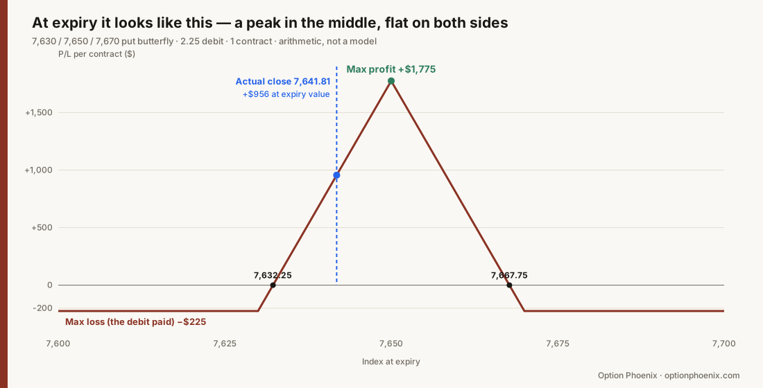
This picture is arithmetic, not a model. Nothing is assumed. Feed in where the index settles and the P/L follows.
The close that day was 7,641.81 — 8.19 points below the center, worth +$956 had I held to expiry.
One more line
debit ÷ wing = 2.25 ÷ 20 = 11.25%
I read that as the breakeven win rate — the win rate at which repeating this decision leaves me flat. At about 11%, I can be wrong eight times and right once and still break even.
In practice there are partial wins and partial losses, so this is a simplification. The direction always holds, though: the more I pay, the higher the win rate the position demands. Everything below hangs off that one line.
2. ⭐ But intraday it is not that shape
The picture above is the shape at expiry. During the session it looks different. Here is the same butterfly drawn at several points in the day.
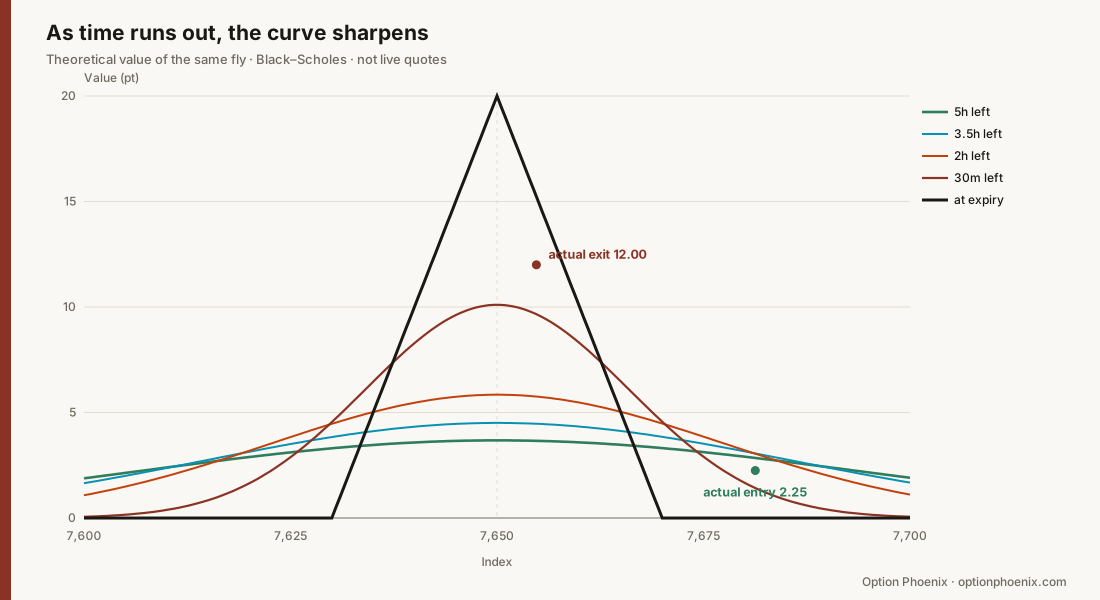
With plenty of time left the curve is nearly flat. As expiry approaches it sharpens to a point at the center.
I think that single sentence is most of what a butterfly is. The numbers make it plainer.
| Time left | at 7,600 | center 7,650 | at 7,690 | Shape |
|---|---|---|---|---|
| 5 hours | 1.9 | 3.8 | 2.4 | nearly flat |
| 3h 30m | 1.6 | 4.5 | 2.4 | slightly convex |
| 2 hours | 1.1 | 5.8 | 2.0 | a hump |
| 30 min | 0.0 | 10.3 | 0.3 | a spike |
| expiry | 0 | 20.0 | 0 | a triangle |
In the morning, wherever I center it, the price sits between 1.9 and 3.8 — the best strike and the worst are a factor of two apart. Thirty minutes from the close, the center holds 10.3 and a strike 40 points away holds 0.3. Effectively all of the value has collected on one point.
A flat curve means every strike prices about the same, which is another way of saying my view is not in the price yet.
A sharp curve is the opposite. The market has already named that level, so the same view now costs far more to express.
3. So the cost splits like this
📌 Dated observation. SPX 0DTE, August 20, 2026 — one session, one butterfly, center 7,650, 20-point wings.
I fixed the center at 7,650 and used the day's actual index to work out what the same fly would have cost, hour by hour.
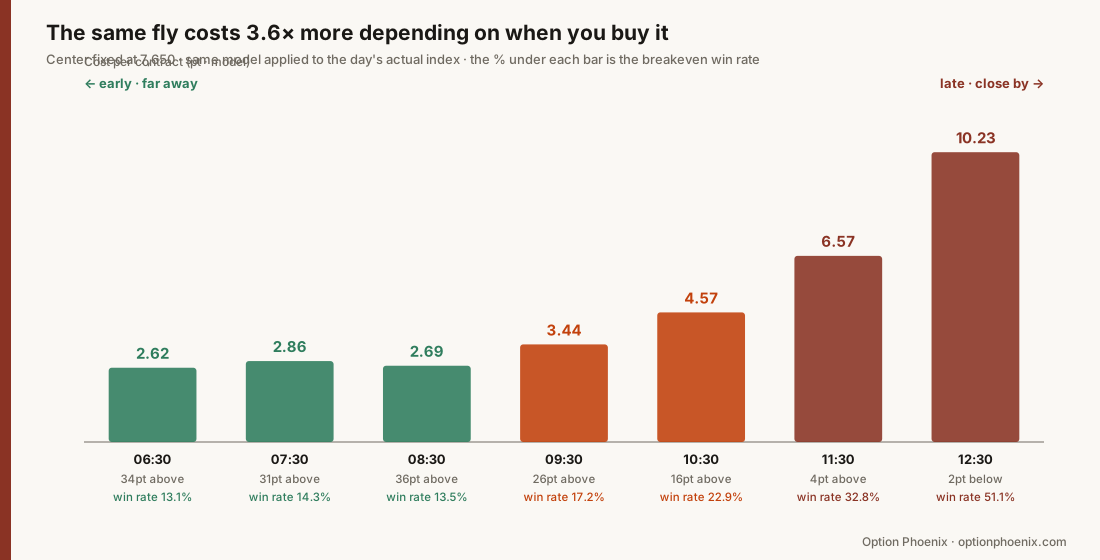
| Entry time | Index then | To center | Cost | Breakeven win rate |
|---|---|---|---|---|
| 06:30 | 7,683.54 | 34pt above | 2.62 | 13.1% |
| 07:30 | 7,680.61 | 31pt above | 2.86 | 14.3% |
| 08:30 | 7,685.69 | 36pt above | 2.69 | 13.5% |
| 09:30 | 7,676.07 | 26pt above | 3.44 | 17.2% |
| 10:30 | 7,666.21 | 16pt above | 4.57 | 22.9% |
| 11:30 | 7,653.68 | 4pt above | 6.57 | 32.8% |
| 12:30 | 7,648.00 | 2pt below | 10.23 | 51.1% |
Same strikes, same expiry, same structure. Only the entry time differs.
Bought in the morning it needs 13% to break even. Bought thirty minutes from the close it needs 51% — the position has turned into one that has to be right half the time.
Two things worked together:
- The index came to the center — from 34 points above to 2 points below. The closer my view came to being right, the more that view cost
- Time ran down — the curve from section 2 sharpened, and value collected near the center
📌 08:30 is cheaper than 07:30, which I made a point of noting. In between, the index moved further from the center (31pt → 36pt). Time keeps draining, but when distance widens the price still falls. The two forces pulled opposite ways there.
4. So how did I pick 7,650
A butterfly needs an answer to "where is this likely to finish" before you can use it at all. Without one, the structure is just a lottery ticket.
Four things pointed me there that day.
| What I looked at | What it said | |
|---|---|---|
| ① | Max pain | The price where the most open interest expires worthless (more) |
| ② | Call flow | Falling all day after the morning high — less and less to push it higher |
| ③ | Pinning level | 7,650 |
| ④ | Where call size had built | Acting as a ceiling above 7,650 |
All four named the same number.
At my entry the index was 7,681 — 31 points above the center. It had not gone there yet, which is why I could buy it at 2.25.
bought after the index reached 7,650   →   6.6 – 10.2
bought at 7,681, centered on 7,650     →   2.25
For the same closing print, the side that took the seat early keeps three or four times as much. That is what the earlier post said, and these three figures are the reason.
5. The exit — where the model and the fills parted
entry   07:09  ·  index 7,681.27  ·  2.25
entry   07:51  ·  index 7,686.46  ·  2.00
exit    12:28  ·  both contracts  ·  12.00
The model missed twice here. I am recording both.
① Entry — model 2.86 vs actual 2.25. The real fill was cheaper.
② Exit — at that time and that index the model said about 10; the fill was 12.00. The real price was richer. Near expiry, same-day options appear to cling to the center harder than the model implies.
⚠️ One day's sample. I am not calling that a rule. But which direction it missed in is worth writing down and counting.
And the last thirty minutes were not quiet
After I closed it, the intrinsic value of this butterfly did this.
12:29  exit    12.00
12:33          19.40
12:52          19.84   ⭐ high
12:54          17.24
12:57          10.60   ← −9.24 off the high in five minutes
12:59  close   11.81
Holding on would have reached 19.84. But that level lasted three minutes, and the next three took half of it away.
Section 2's curve makes that unsurprising. Sharp means "large at the center" and "steep just outside it" at the same time. A structure that pays more the closer you get to expiry is, for exactly the same reason, one that can hand it back in the final minutes.
So this is where I landed.
I set the target price first, and the limit order goes in right after entry.
My target that day was 15.0, and intrinsic value was 15.23 at 12:25 — inside reach. But the order was never resting, and doing it by hand let one more judgment call in.
That is homework for me, not advice. And I will not claim a resting limit would have filled — the actual quotes from that window cannot be reconstructed.
6. About the numbers in this post
Some of these need to be read differently from others.
| ✅ Arithmetic | Section 1's payoff figure, max profit, max loss, breakevens. Nothing assumed |
| ✅ Observed | Index levels in the tables, fill prices and times, the intrinsic-value track |
| ⚠️ Model | The curves and costs in sections 2 and 3. Black–Scholes, one volatility |
The model's volatility is 9.7% annualized, backed out of the implied move the options carried that day (±47.2pt). It is not a number I picked to fit — but holding it fixed all day is itself unlike the real market, where volatility moves continuously.
That is why section 5 records where the model missed. The shape and direction of the curve are worth trusting; the individual figures are not.
7. What I still do not know
- Whether same-day options really cling to the center harder than the model — that day's fill sat above the model. One observation. I intend to count it daily.
- How often the last ten minutes give it back — that day it was −9.24 off the high in five minutes. Also one observation. I am recording the closing ten minutes from now on.
- What to do when the four inputs disagree — that day all four named the same number, which made it easy. I have no record of a day where they split.
※ These are records of my own trading and the reasoning behind it, not a recommendation to trade any security or strike. Same-day options can lose the entire amount committed within one session. The curves here are model calculations for illustration and do not guarantee any market price. All investment decisions and their outcomes are your own.
How was this to follow?
Knowing where it got hard is what lets me fix the next one. No name, no email.
Get the One-Page Options Field Guide
A strategy selector for bull, bear, and sideways markets, a pre-order checklist, and a glossary.
If this was useful
Why gamma, call walls, and put walls behave the way they do comes down to the structure of the options market. These books lay out that structure in order.
- Strategic US Options Trading I: Fundamentals — Start here if options are new — from reading the chain
- Strategic US Options Trading II: Strategies — When you want to actually place the order
- Strategic US Options Trading III: Advanced Strategies — When you want cash flow in a sideways market
Earlier posts live on Tistory. I'm moving them here a few at a time. optiontrading.tistory.com
Questions?
There are no comments or a guestbook here. Email me with questions about a post or to report an error — I read and reply. I don't give individual investment advice.
hello@optionphoenix.com